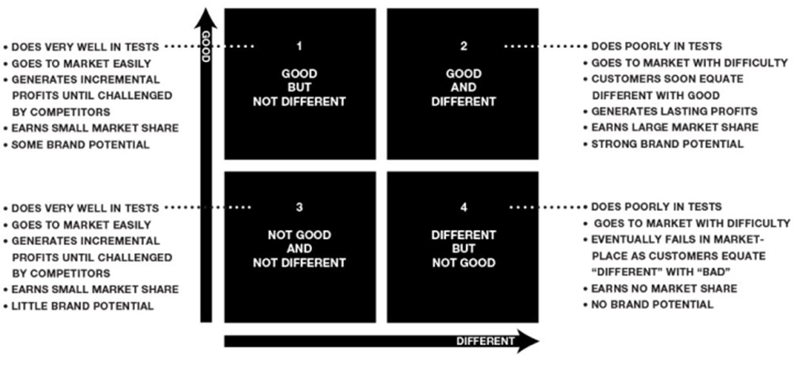
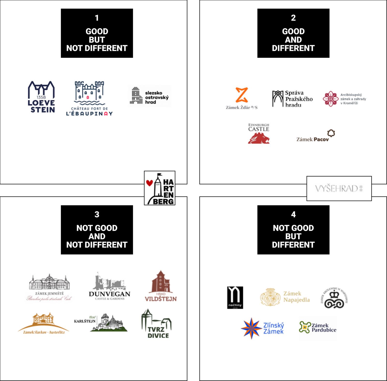
Now let's see what happens in each quadrant and what can be deduced from it:
Good & Different (2nd quadrant)
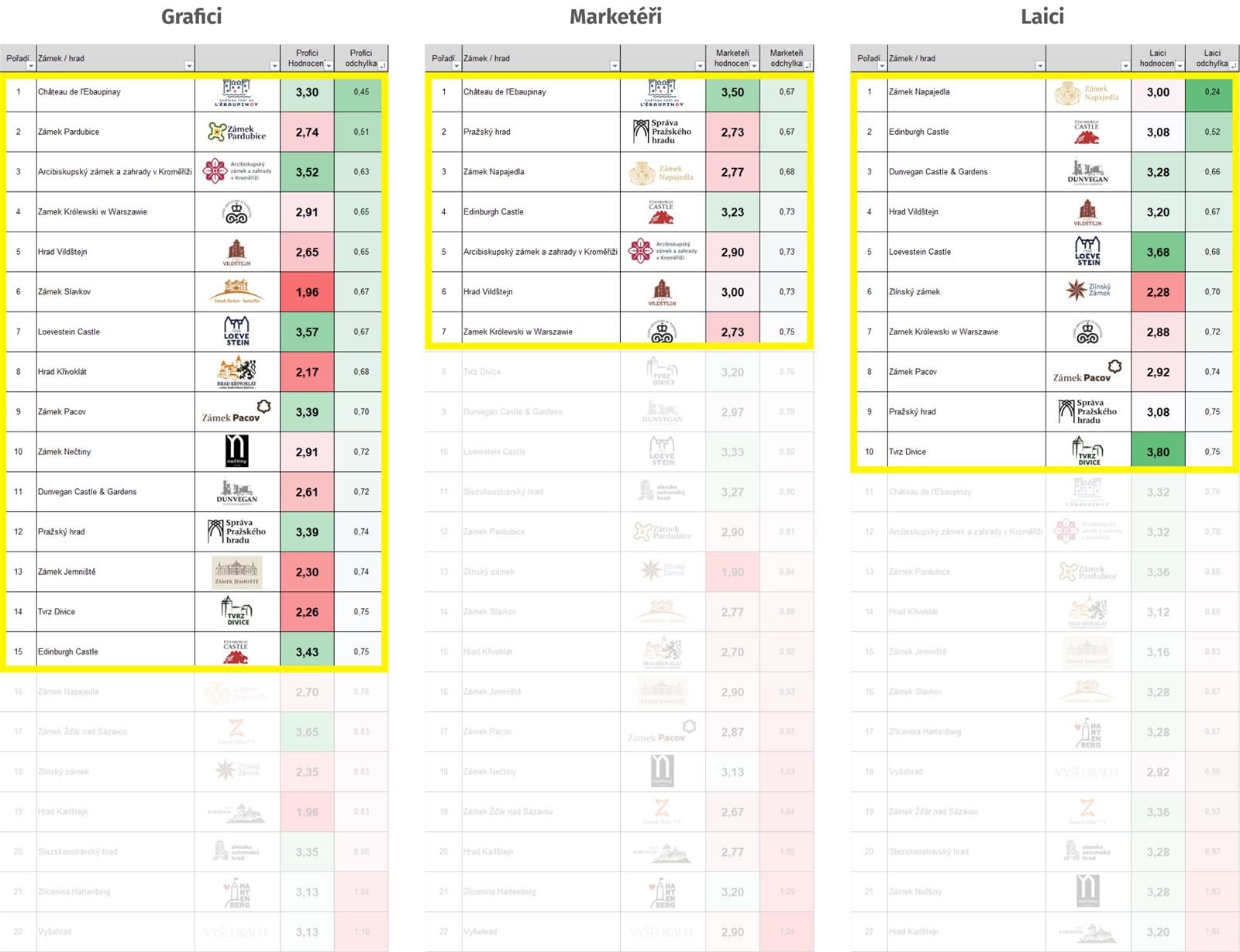
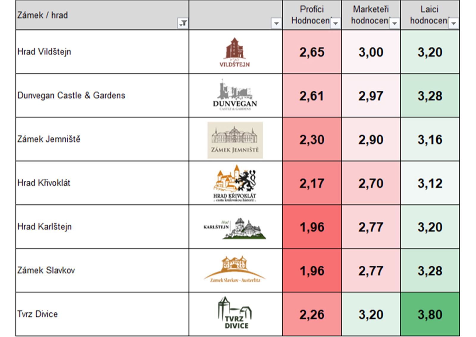
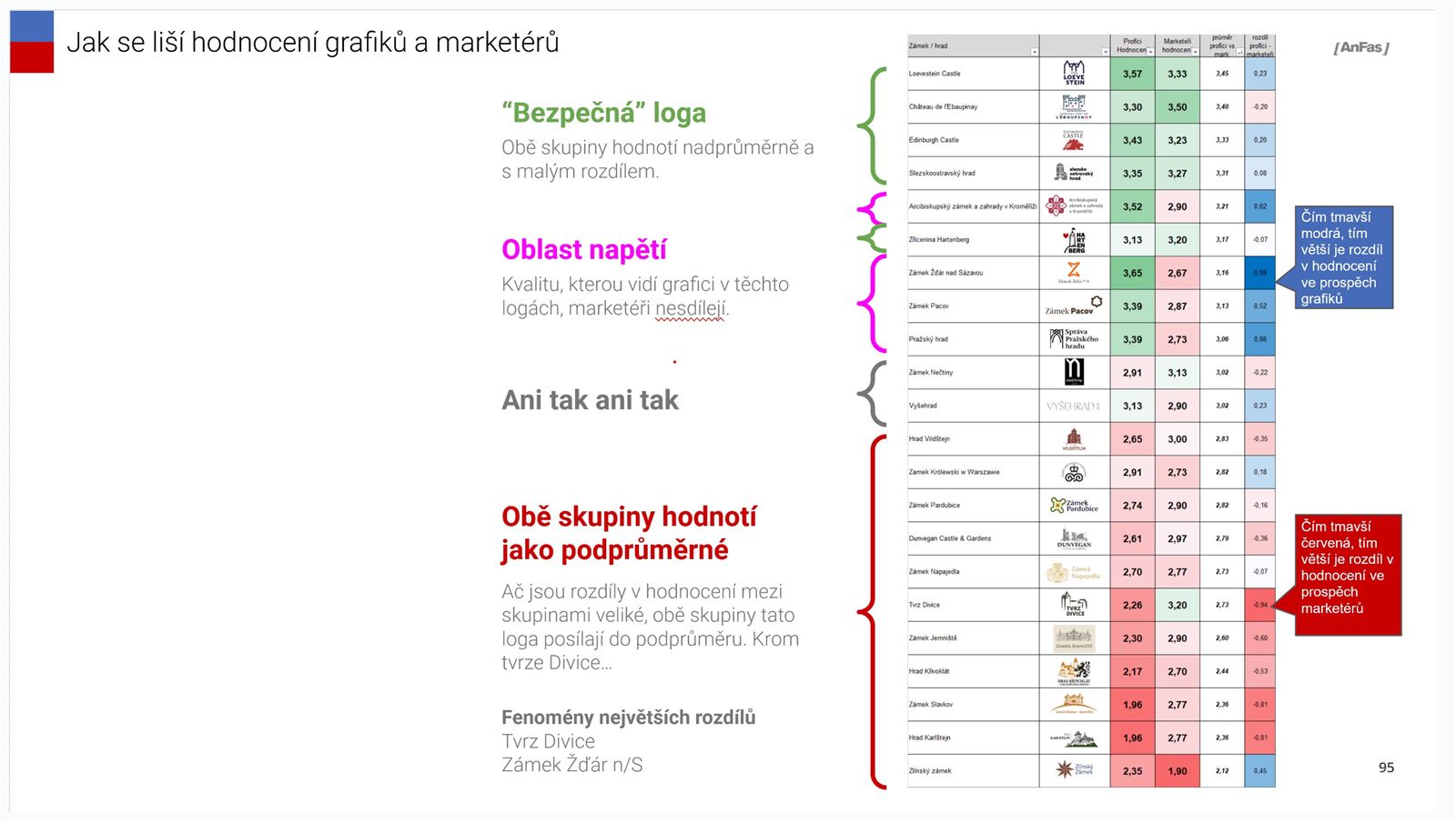
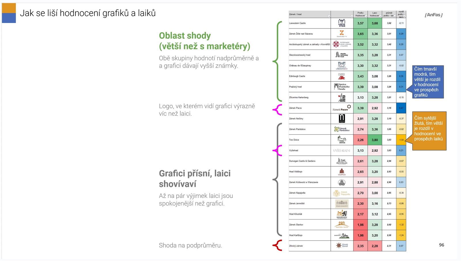
Logos from this quadrant were well rated by designers and mostly poorly by everyone else. In a consumer test, they probably wouldn't score very well.
All of us (designers and marketers) try to make things that are good and different. It brings the greatest benefit to companies and brands in the long term.
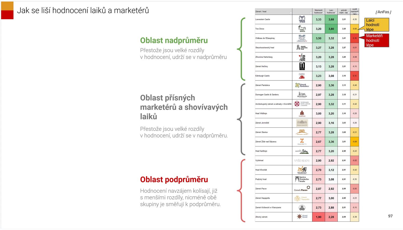
That difference scares the consumer (layperson) is to be expected. But in this test, it turned out that difference ultimately scared marketers more than laypeople. So if you want to succeed with difference, you need to be able to deliver quality and have a highly educated client. One who has a vision that will overcome the initial animosity of the audience.
If you find each other, wonderful. Your work will function for a long time. It will become an important recognizing feature of the brand it represents. No one will want to change it. And it will age very slowly.
I'll try to remember in 10 years :) Although that's not such a long time.
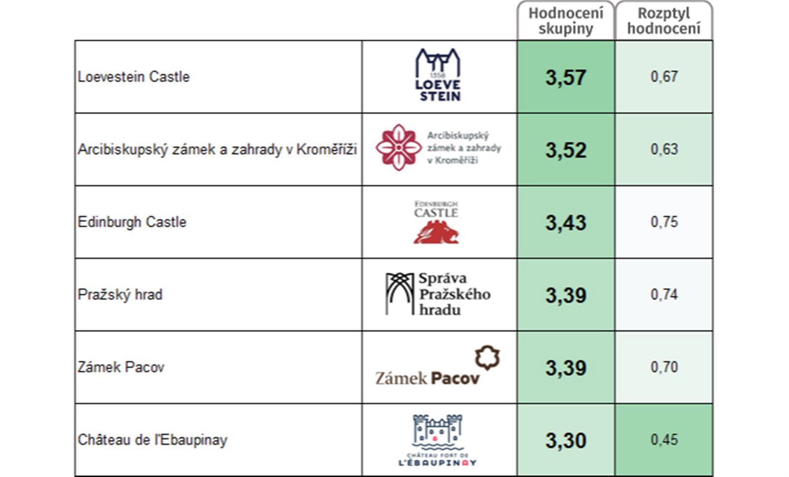
Good BUT Not Different (1st quadrant)
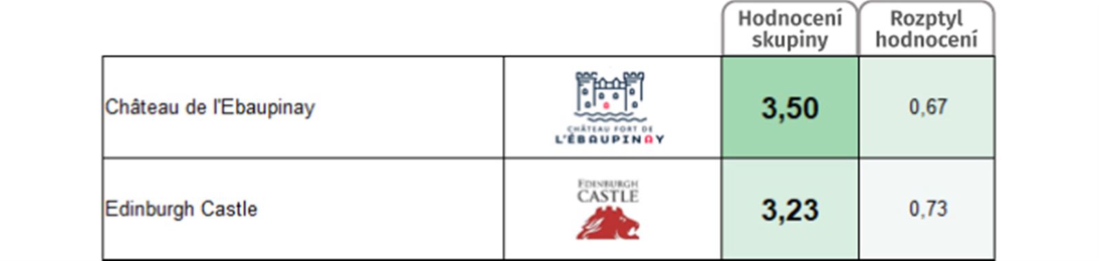
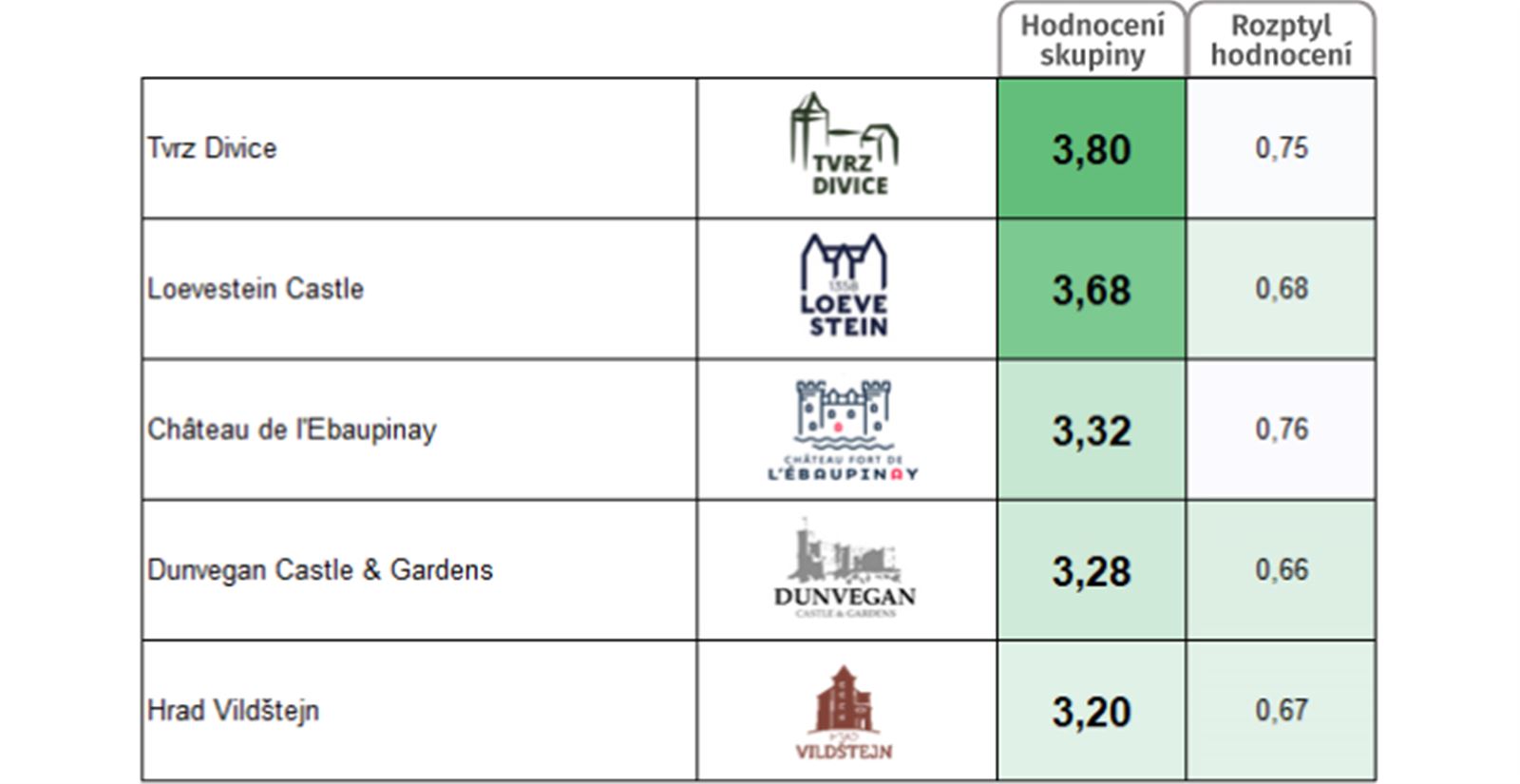
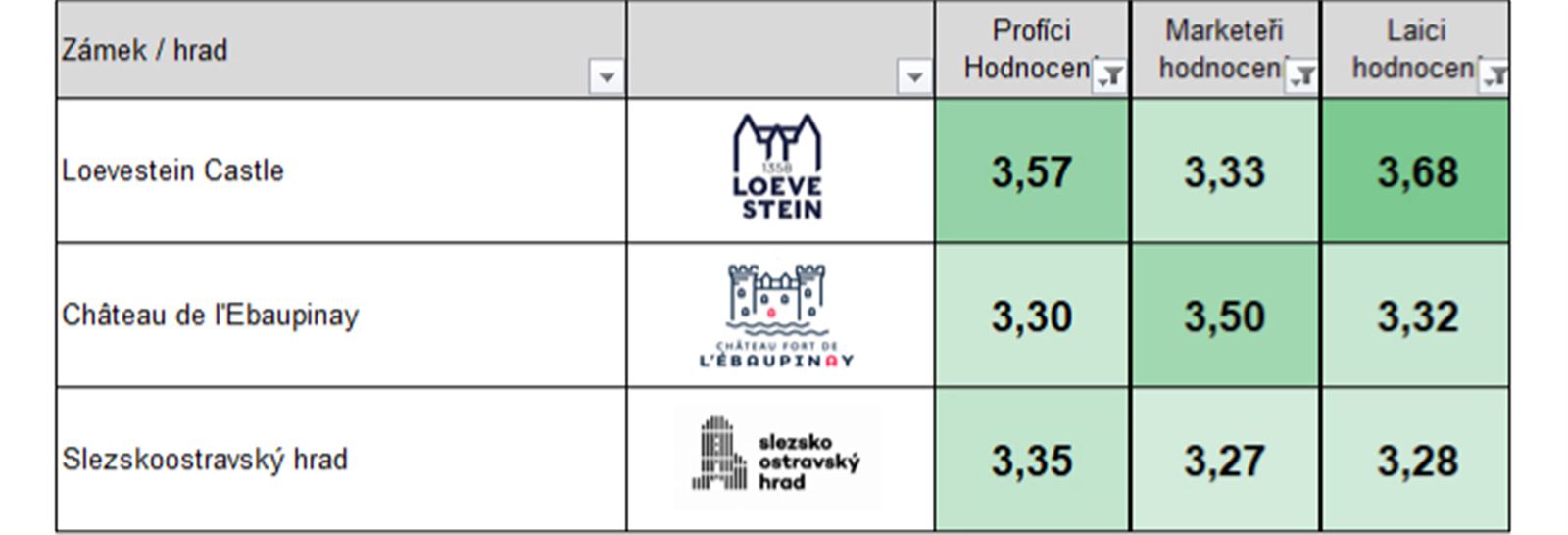
Logos from this quadrant meet expectations and scored well. In addition to designers, also with laypeople and marketers.
If you as a creator want to reduce problems with the acceptance of your work, or if you have a client who is not very well-informed, it is better to get into this quadrant. Not being too original and innovative. Your work will then bother the fewest people. Consumers won't really care anyway. In their eyes, you win by not differing from "how it usually is." You will manage to push such work through more easily. But your work will help and represent decently. Over time, it will get "old" and "worn out," because it probably won't be timeless. And then it gets replaced. In any case, even such a result is worth it.
Not Good & Not Different (3rd quadrant)
Logos that were rated poorly by designers were rated quite favorably, especially by laypeople.
If you as a creator are conformist, predictable, your imperfections and craft flaws will pass. Cliché is welcomed by a certain part of the audience. Where there are no high demands, your work will be accepted and will somehow function until its shortcomings force someone responsible to replace it with a higher quality one (for instance, from the "good but not different" quadrant).
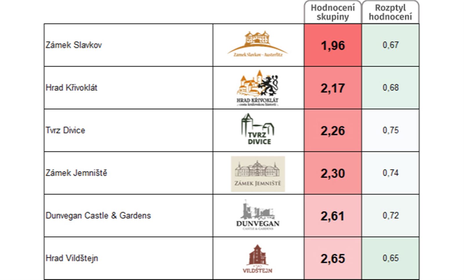
Not Good BUT Different (4th quadrant)
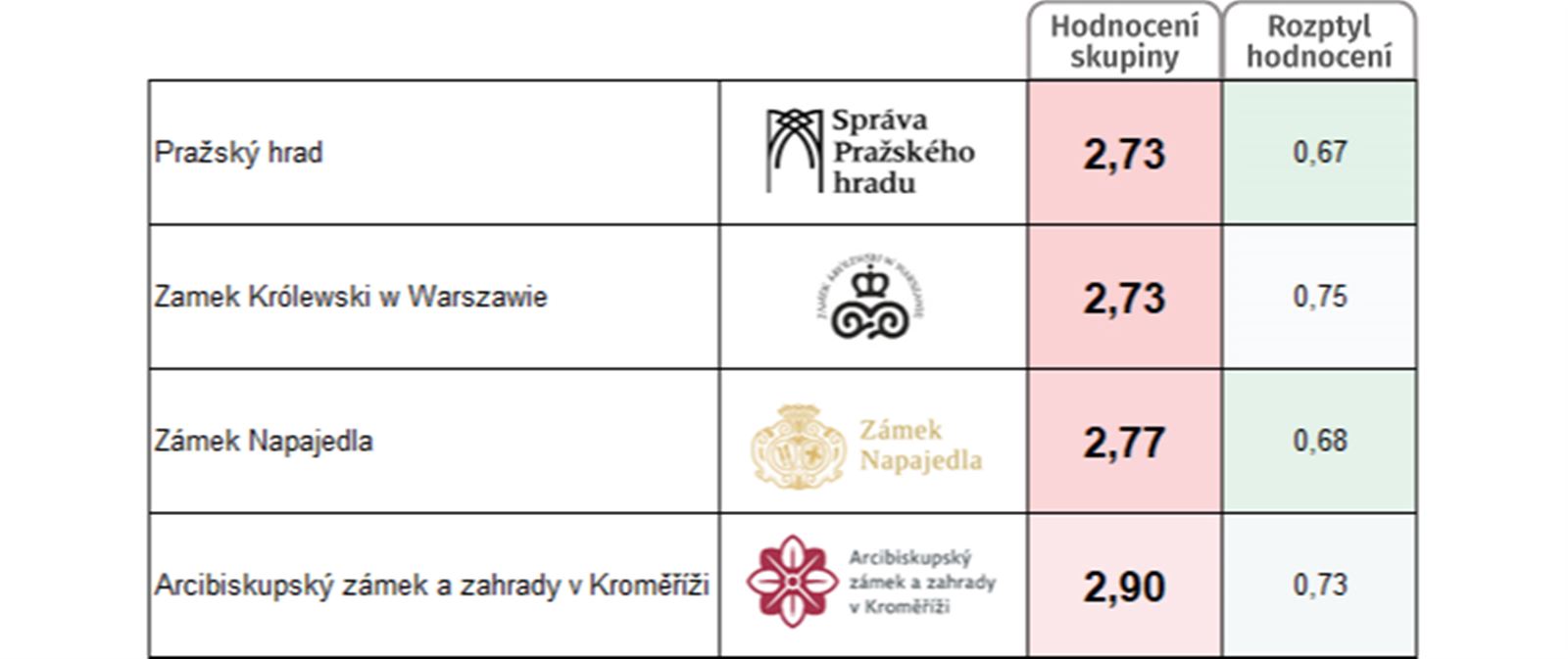
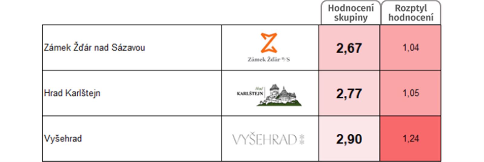
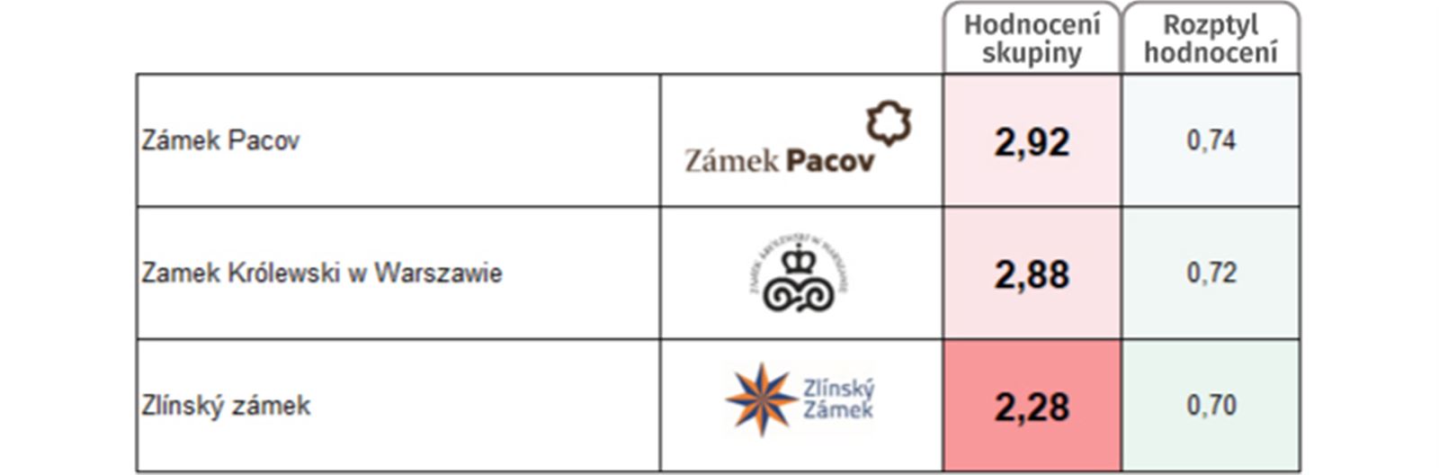
Logos from this quadrant were rated poorly across all groups.
If you want to be original, different, it is necessary to be able to deliver work that carries the proverbial "touch of the artist" and lacks craft flaws. Otherwise, your work falls into this quadrant. It suffers from misunderstanding from all sides, is not accepted, or is accepted but not respected, and is exchanged, replaced in a relatively short time.