Menu

How to build solid foundations for a new brand

Client

Pivovar Beránek

A local microbrewery with a nationwide ambition, which had the bar set very high from the start. And enlightened founders Roman Štajner and Vladimír Beránek, who realized that in a country with more than 500 microbreweries, it is not enough to have good beer – the brand must have character. Our task was to help them transform this idea into a visual language and create an identity that would be a solid part of the Pivovar Beránek story from the very first tapped keg.

What we did

Logo, visual style, and labels

Step 1

Who are you? And who, on the other hand, are you not?

In search of the right direction, we looked at how breweries communicate both domestically and abroad. We mapped their visual styles and organized them from traditional brands, through typographical solutions, to distinctly illustrated labels. Defining the position on the scale helped make quick decisions about who the brand wants to be and how it wants to come across. Thanks to this, the path to the result became significantly more efficient, and we could fully focus on fine-tuning every detail.
 

Step 2

When you know where you're going, it goes faster

A clearly defined framework speeded up the whole process. Even the very first versions of the logo aimed at the target. Gradually we refined our aim to hit the bullseye.

Step 3

Implementation

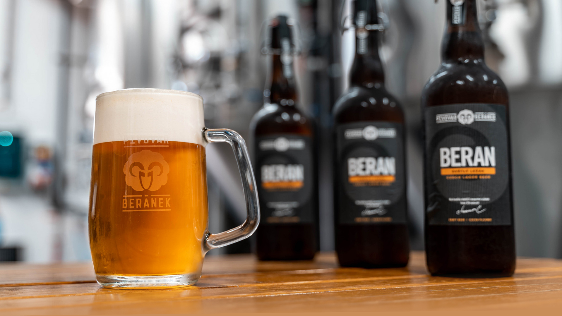
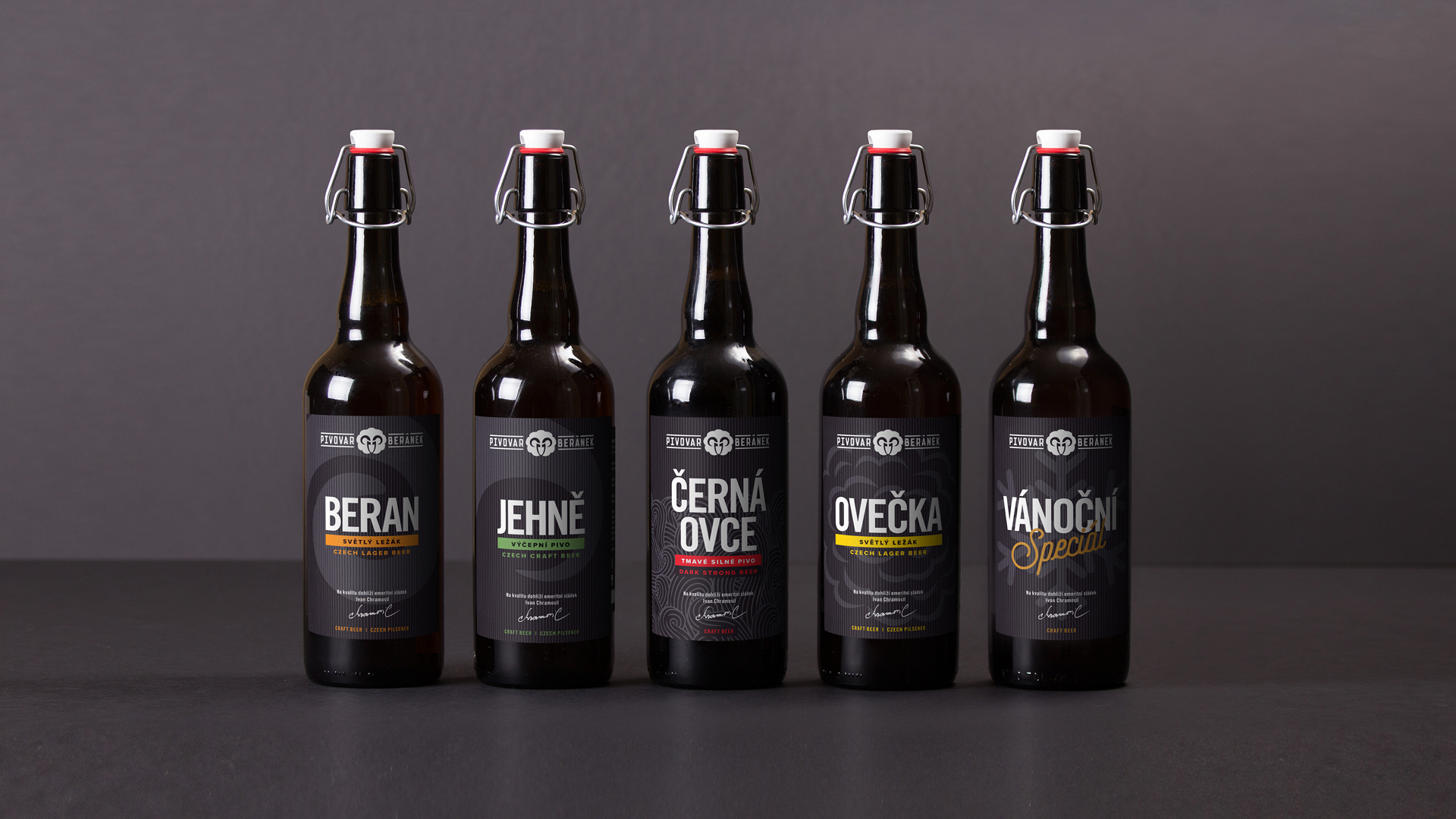
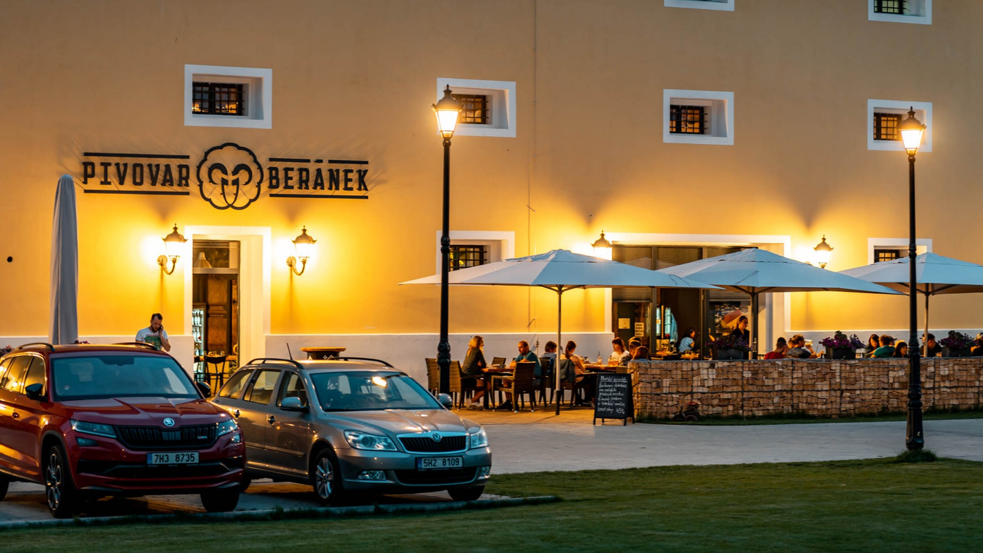
The visual style permeated bottle labels, pint glasses, cookies, and kegs. Right from the start, we stuck to the direction we had clarified together at the very beginning. And the client could thus focus on what they do best. Brewing good beer.

To this day, the brand functions without fundamental changes; an honest foundation is recognized in both the beer and the visuals.


design etiket
logo a vizuální styl

Photo: Aneta Loužilová Beránková

Does it look simple? There is no need to make a science out of it when you know how to do it.

How can we help you?


Insights

Follow our social media