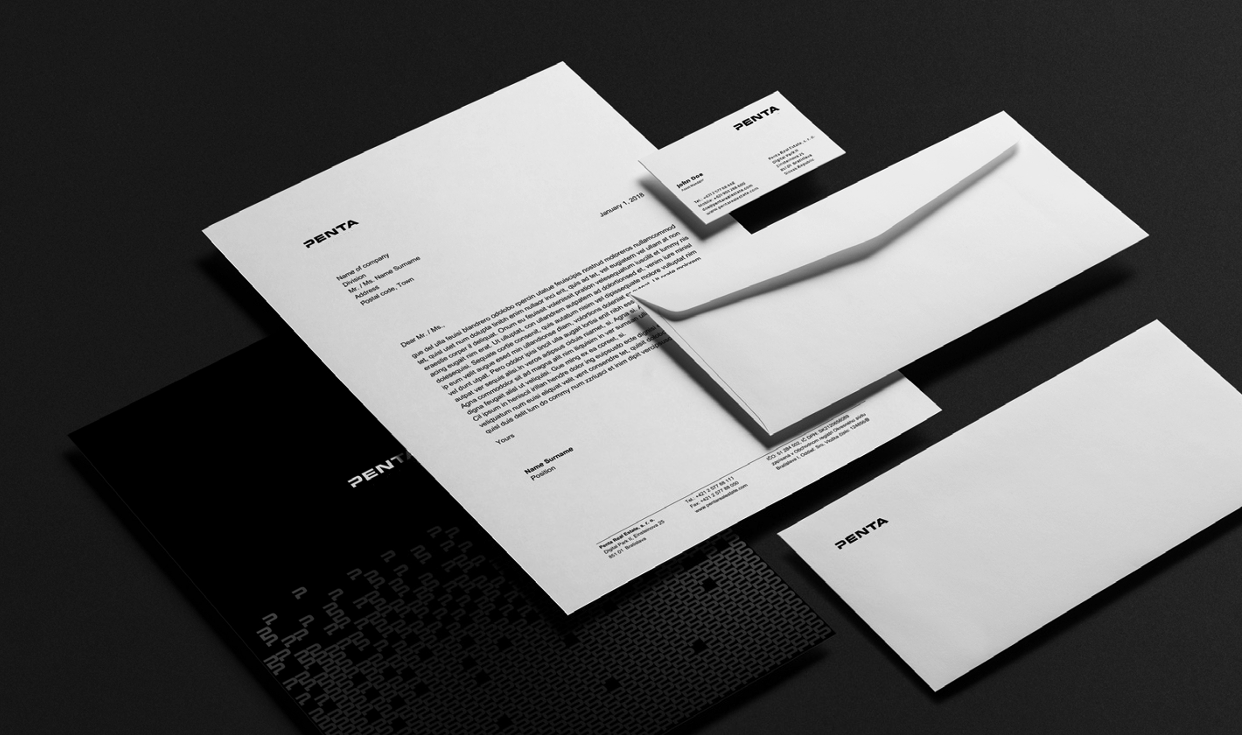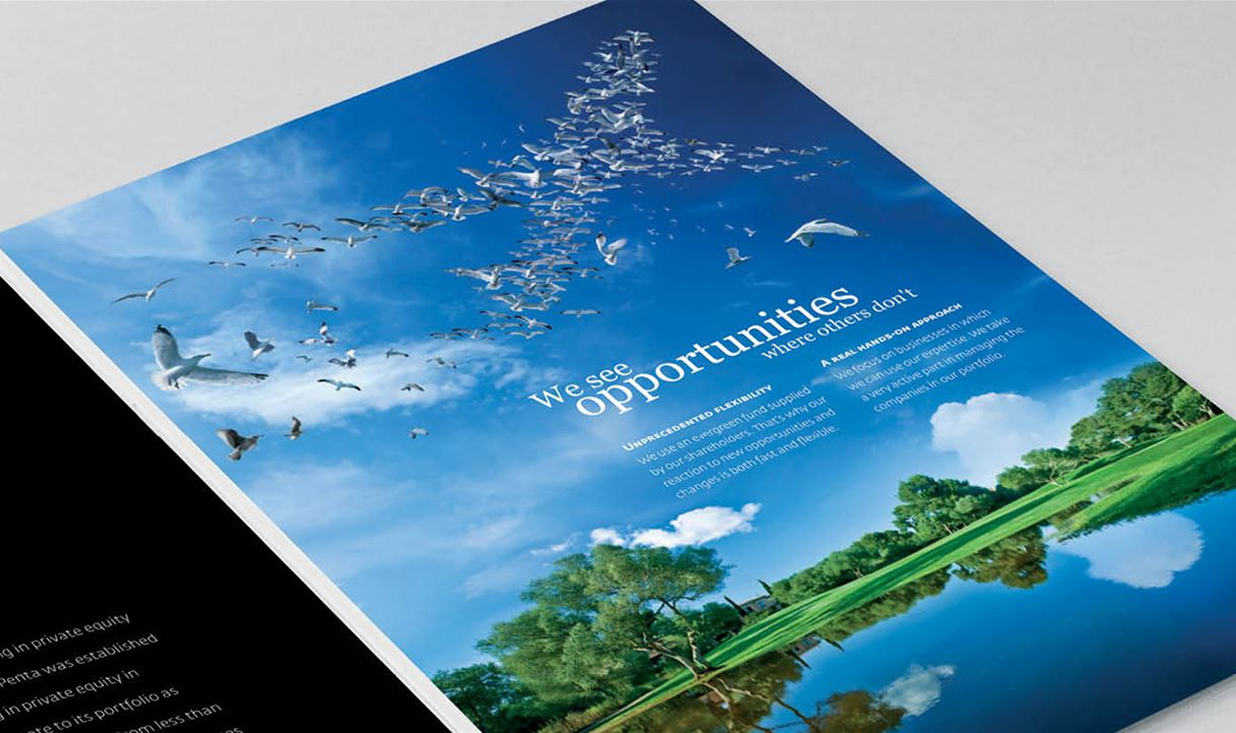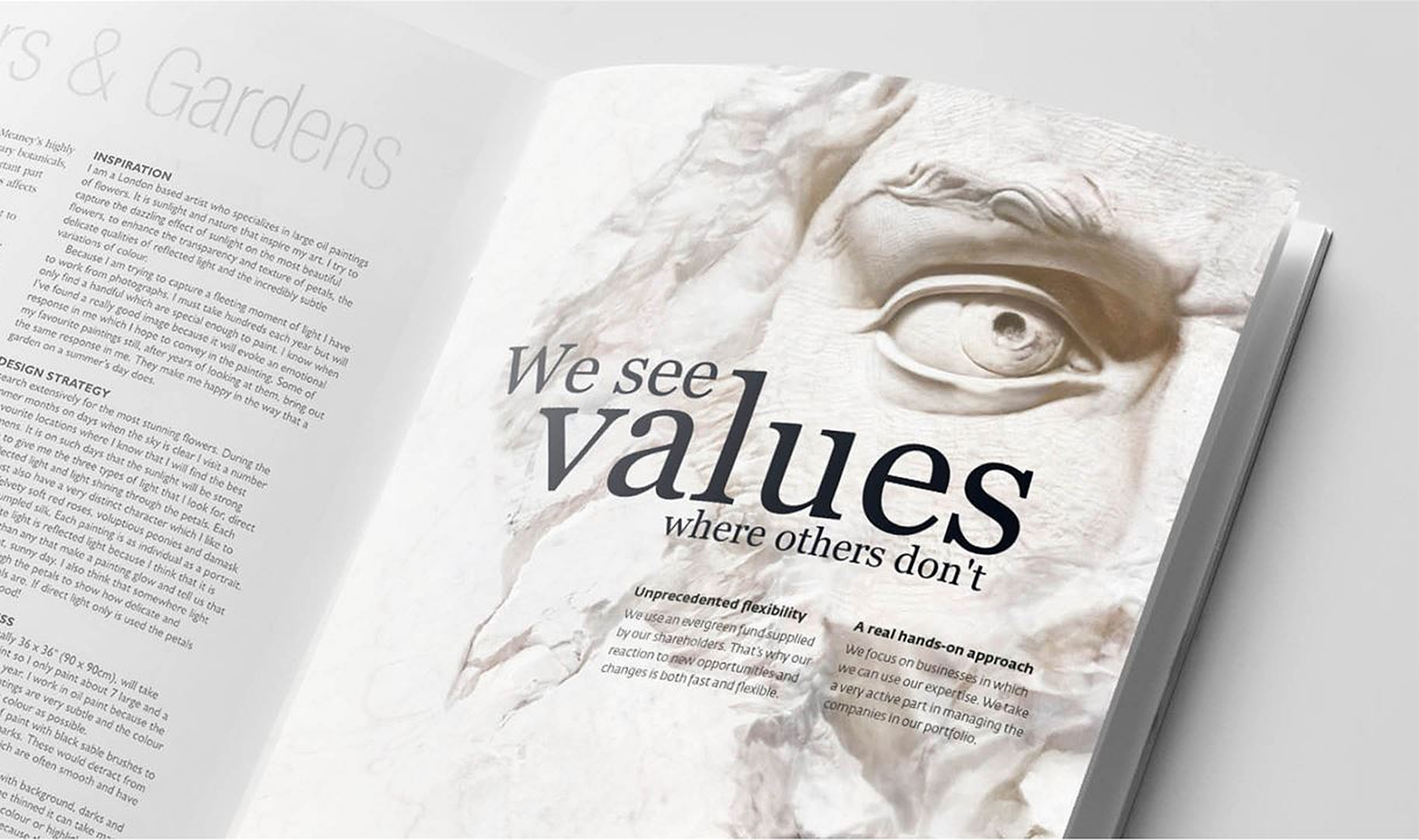
We took care of Penta's style right from the start of our cooperation, when we created additional visual elements and a graphic manual to accompany their original pentagonal logo. In 2010, Penta decided to make a bigger change and commissioned us to design a new logo and visual identity. We went down the route of minimalism.
As the classic says:
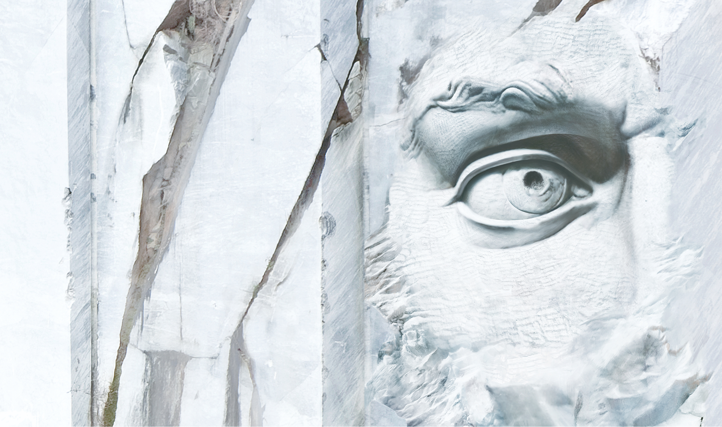
"Perfection is achieved, not when there is nothing more to add, but when there is nothing left to take away."
Commercial and representative materials were created in the new style, as well as a comprehensive document system that efficiently simplified office work at Penta. Our manual Identity Online helped with the introduction and roll-out of the style across the entire group in several countries.