Nanoptiqs brings revolutionary nanostructured optical elements to the market that can control light with incredible precision. The problem? Explaining this technology to lighting manufacturers quickly, clearly, and in a way that excites them.
When you develop an innovative product, you need to explain clearly how you change the rules of the game
Client
Nanoptiqs
A manufacturer of nanostructured optical elements with extraordinary properties needed an identity and marketing strategy that match its position as an innovator in the field of nanotechnology.
What we did
Name, logo, visual style, communication strategy, and website
Step 1
Positioning
Why don't we start with creative work, but with strategy?
Before we dive into the name, logo, and visuals, we need to know where the new brand will stand in the market. In this project, it played a crucial role – it is an entirely innovative product that must first explain its value. There is nothing like it on the market, and therefore there is no demand.
It is not a finished product for end customers, but an ingredient brand – a component for light fixtures that every manufacturer will use differently. Therefore, we looked for a position that emphasizes versatility, technological maturity, and added value for both design and production.
Positioning helped us answer the questions:
- In what exact way does the new brand come to change the market?
- What problem does it solve for light fixture manufacturers?
- How should the brand behave to gain trust?
This method works wonderfully for us in other projects as well – it helps create a solid foundation on which the entire creative part then stands.
Finding the essence:
The 6 most important characteristics of the new technology
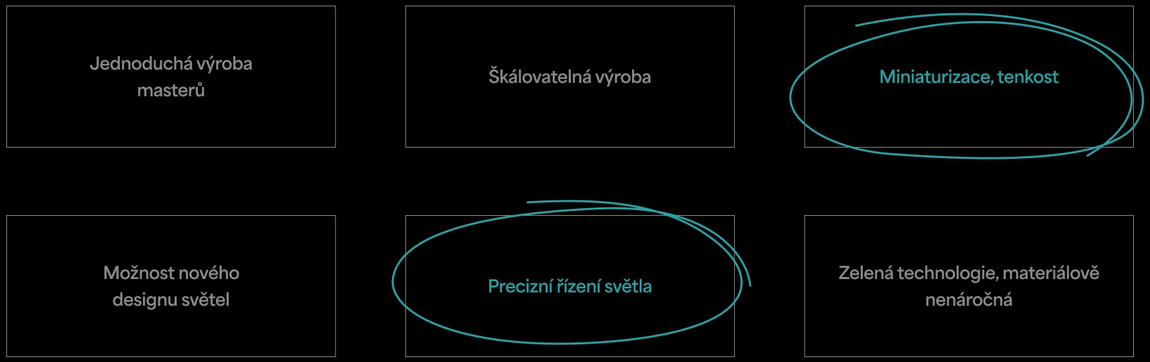
What will differentiate the brand most from the competition and at the same time bring the greatest benefit to customers?
Two properties were key: thinness and precise light control. Why exactly these two? Imagine optics that can handle what used to be possible only with robust lenses and reflectors – and yet are so thin that they change the rules of the game. That is not just a technical innovation; that is freedom for designers. What they can achieve with it is up to their creativity.

Step 2
Name
From keywords to a name with a clear meaning
A good name starts with understanding what the brand represents. It's not just about sounding nice. It is always a plus when a name suggests what the brand does or why it's exceptional. In a similar brief, it has proven successful for us to work with keywords associated with the given field or technology – in this case, "thin, optics, nano, light, radiation, miracle, precise light control," etc. This helps us give the name direction and context.
And at the same time, when creating a name, we watch out for these few rules:
- It will be based on the main characteristics of the product
- It will be capable of international use
- Clear pronunciation in Czech and English
- Maximum of four syllables
- It will be legally protectable
- It will have a free ".com" domain
Based on this brief, roughly 50 names appeared on the longlist. From them emerged four most promising candidates, which we sent for further testing.
And the winner?

Step 3
Logo
A visual shortcut that confirms what the name promises
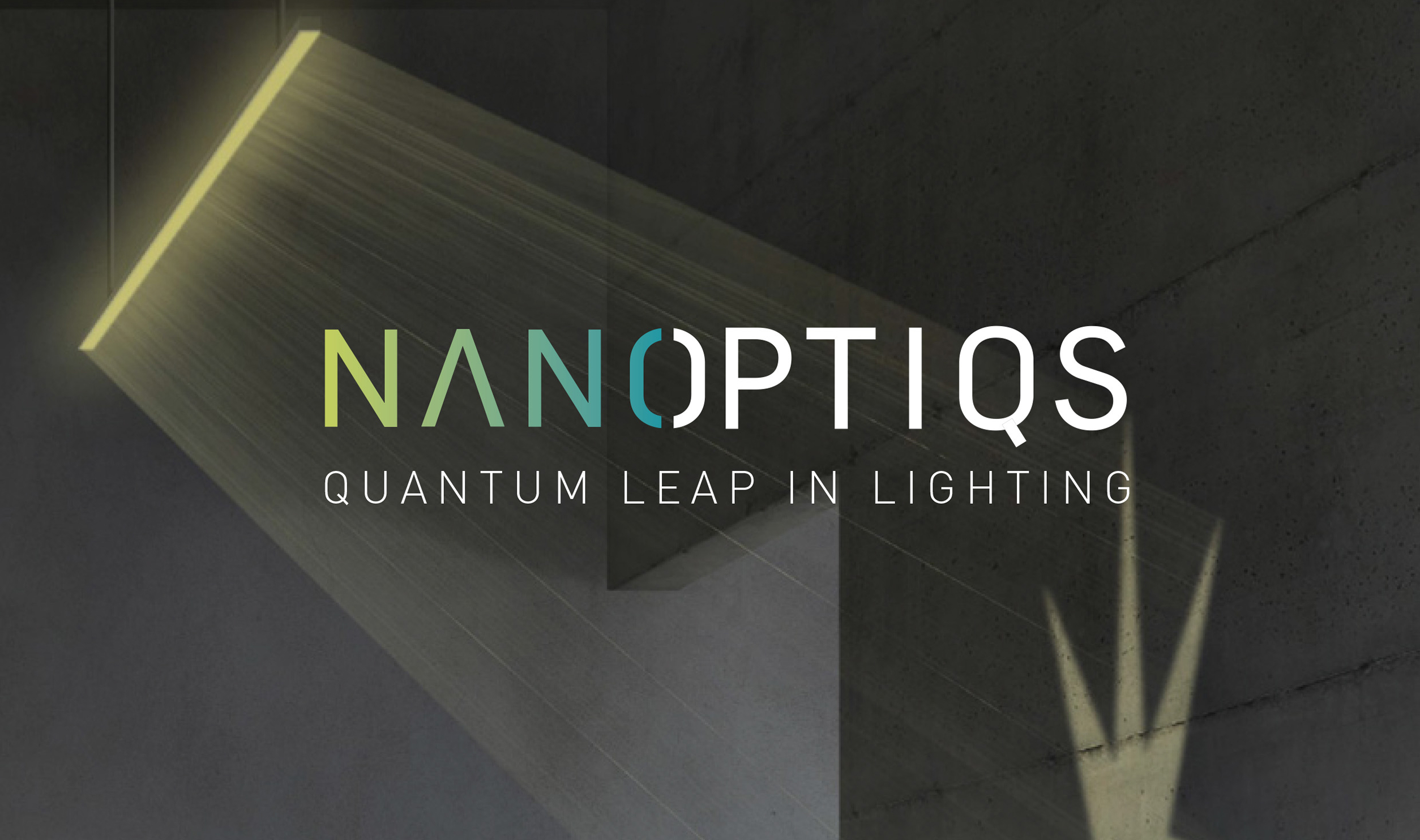
The visual identity followed up on the name. We built the Nanoptiqs logo on simplicity and cleanliness – the lettering style is thin and precise, just like the technology itself. The color execution and the split letter "O" beautifully separate and at the same time connect the words "nano" and "optics".

Step 4
Website
Communication for a brand ready for global markets
Všechno, co jsme si definovali v průběhu procesu, se projevilo na webu nové firmy. Web je určen výrobcům svítidel a seznamuje je s tím, proč komponenty firmy Nanoptiqs stojí za jejich pozornost. Sekvence sdělení jde od vlastností po přínosy a výrobní přednosti.
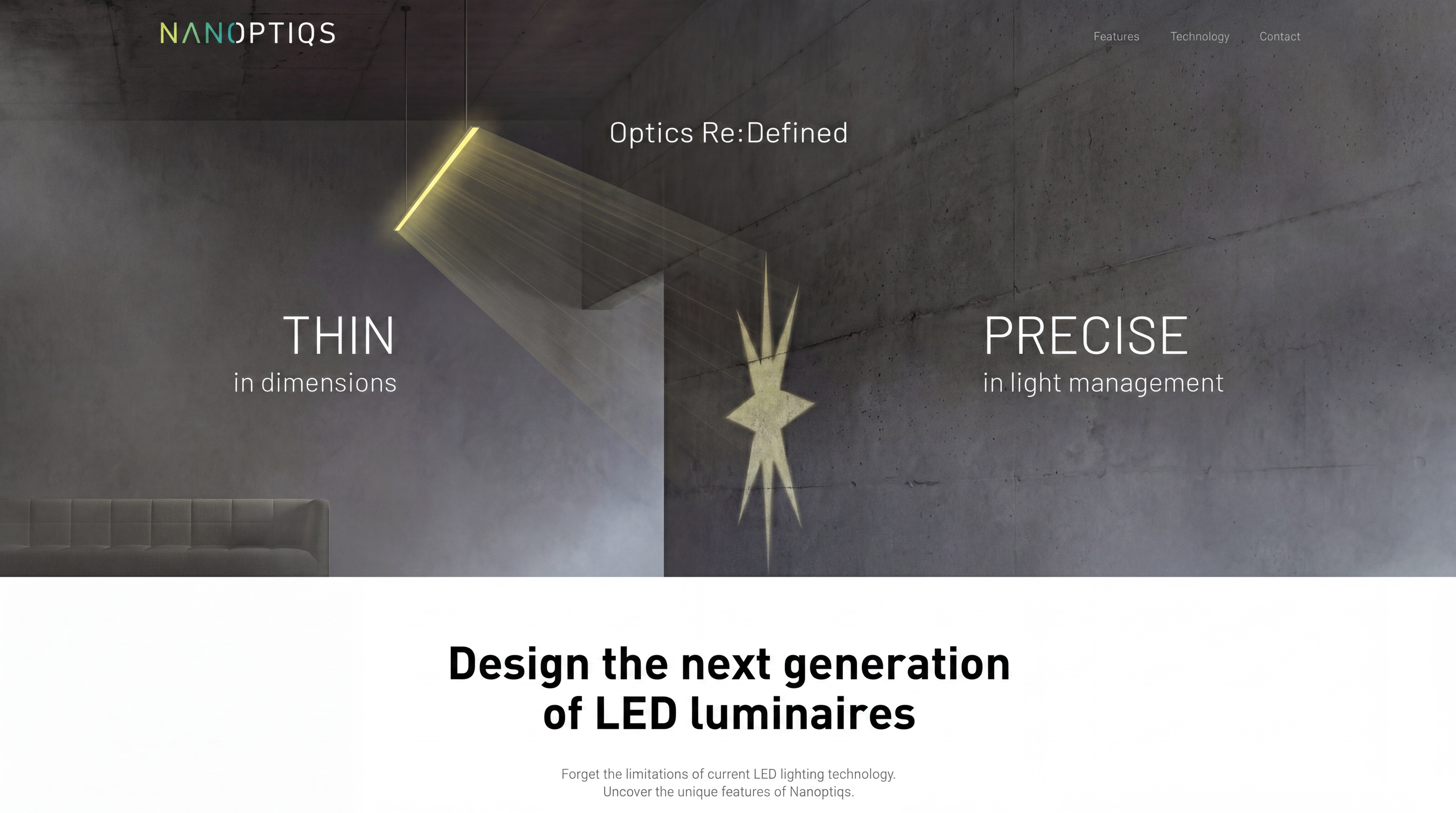
#1 Intro panel:
What it is and what makes it special
We set the standard, presenting 2 complementary key properties: Optics that are dimensionally thin and yet precisely control light.
#2 Main benefit
Nanoptiqs optics replace bulky, structurally complex elements (reflector and lens) and send them to the scrap heap.

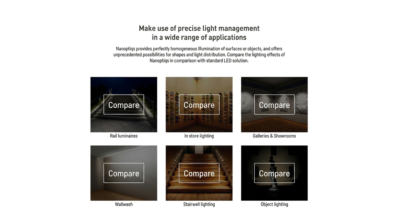
#3 Specific examples
Situations where the advantages and utility of Nanoptiqs become apparent compared to standard optics.
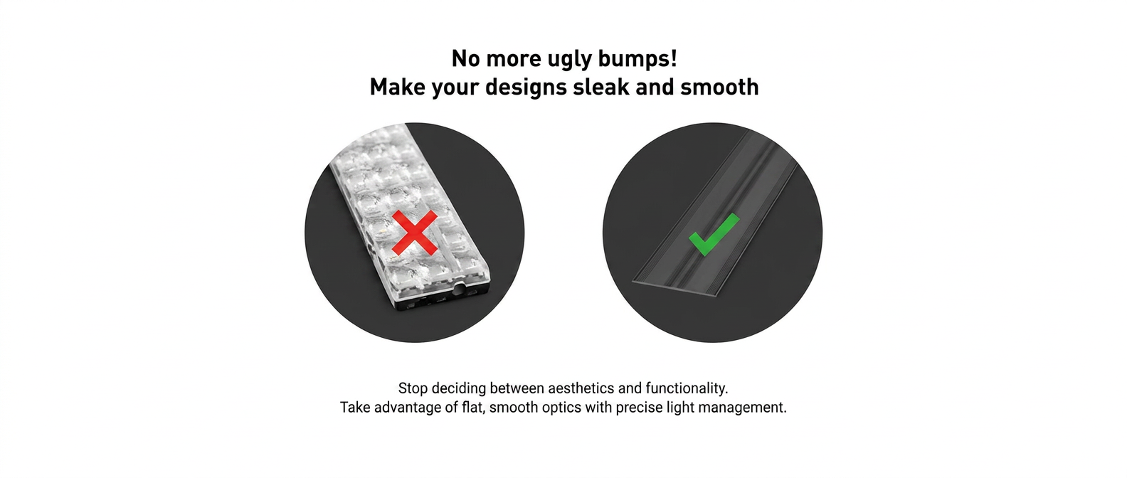
#4 Argument for light fixture designers
We present the elegance of a smooth nano-surface in comparison with classic molded optics.
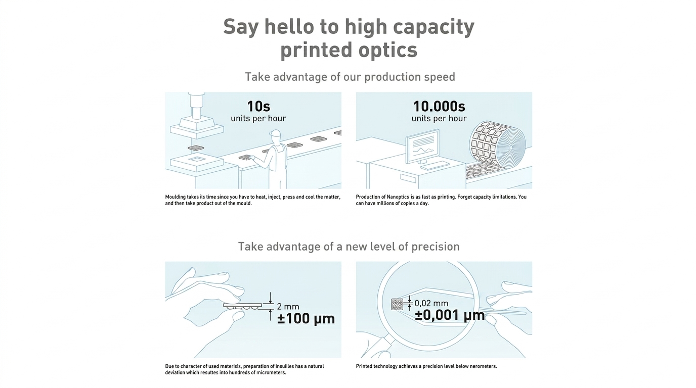
#5 Argument for buyers and technologists
High production capacity and an attractive price.
What we learned

Tomáš Kostkan
Principal & Consultant
The strength of a brand begins with a clear reason why the world needs it
This work reconfirmed how important it is to look at a brand through the eyes of future customers. It is not enough to have breakthrough technology – to find its way into the market, it needs a clear identity and a message that manufacturers and designers can identify with.
We searched for the essential, discarding the secondary. We built the brand on what has the greatest strength – in this case, the thinness of the optics and the ability to precisely control light. We succeeded in creating a name, logo, and visual identity that became the foundation for an ingredient brand with the potential to become a new standard in the lighting industry.
Credits
strategy/copy
Tomáš Kostkan
design
Petr Vorasický