From a new name to a stronger brand
Client
Digiteq Automotive
The company e4t (electronics for transportation) started in 2001 as an electronics tester for Škoda vehicles and a provider of development capacities. When we met, it was already an established developer with the ambition to strengthen its role within the Volkswagen Group. Shortly after launching the internal transformation, we began creating a new name, logo, and visual identity together – and successfully handled all the challenges that this process brought.
What we did
Helped change the name and kickstart the transformation into an independent, confident brand
Challenge 1
Name change?
The first task was to assess the original name e4t. People in management suspected it might be one of the obstacles to further development, but they needed to rely on an expert opinion. The results of our testing largely confirmed their assumptions: the name was difficult to read, and few people associated it with modern topics like digitalization or autonomous systems. This could be a problem when searching for new engineers.
But a serious decision needs arguments. A detailed analysis helped management defend the renaming – both towards the parent companies and within the organization. A name change carries not only costs but also strong emotions that can affect internal corporate relationships.
Challenge 2
A great name is somewhere between the lines
Mapping
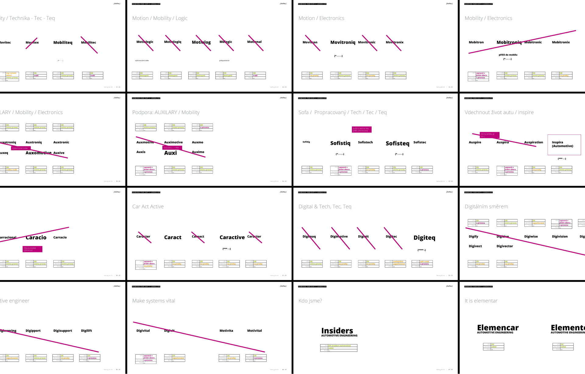
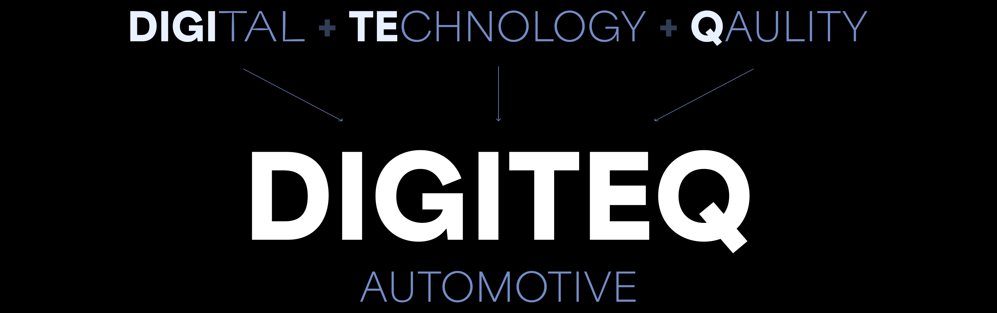
There are many different methodologies and tools for finding a name, but you never have a universal (and reliable) recipe in hand, because every situation is unique. First, we needed to truly understand the company – which is not easy in the B2B sector. We drew on a workshop, interviews, and our own research into the field, which revealed important insights that clients often do not articulate. Based on this, we identified a direction and gradually narrowed the selection down to five names. Then came the key question: How to choose the right one?
Verification
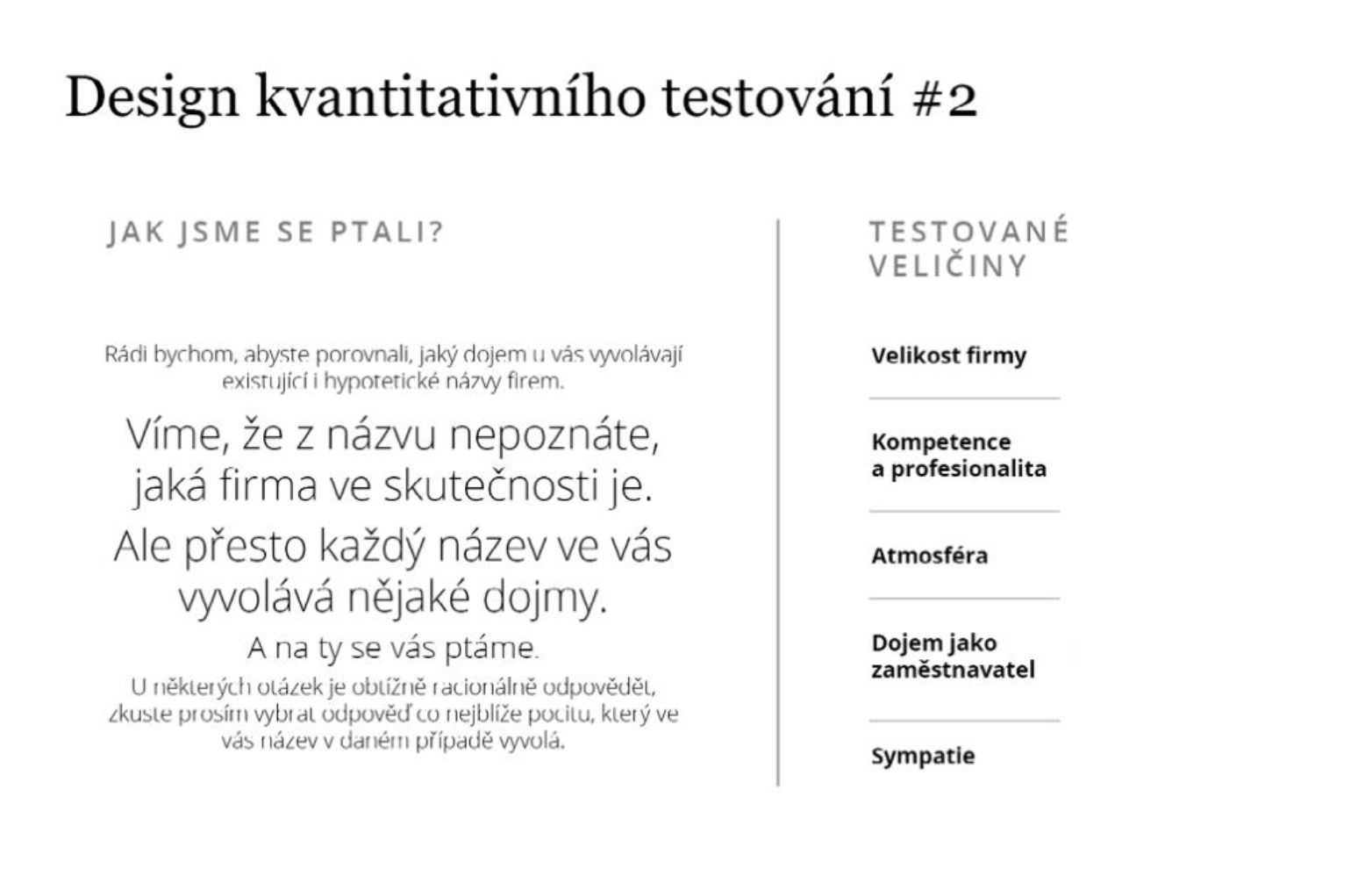
Testing names for a corporate automotive company requires a targeted approach – regular consumers are not enough; it's necessary to reach decision-makers. We used our own network of verified professionals for this and investigated what emotions the names evoke, how they align with corporate values, and what their strengths and weaknesses are. The test took place qualitatively (interviews with marketing and management experts) and quantitatively (students of technical fields and corporate managers) and we obtained very valuable data from it.
How to ensure that employees embrace the change?
To make the implementation of the new name successful, people inside the company must primarily embrace the change. The management of e4t/Digiteq approached communicating the change to employees and corporate partners responsibly, and a complete communication package was created: a simple microsite, a presentation for employees, letters for corporate partners, an explanatory video, and many other outputs.
A face-to-face meeting with employees took place in Mladá Boleslav, where we explained the change as a logical part of the company's gradual transformation and the result of a creative dialogue. And to emphasize the fact that the new name "didn't fall from the sky," we also briefly walked them through the entire process of how the new name was born. Thanks to this, people at Digiteq had the chance to feel what an important step the company was currently going through and what it would mean for its future.
Challenge 3
Creative work
Several studios participated in creating the new logo and visuals – Digiteq wanted to see different solutions and choose the best one.
What is important for a good logo according to us? We always look for the simplest, most original expression of the name or spirit of the company. A good logo should be simple but not primitive. Original but understandable. Contemporary but not subject to trends. Strong but not intrusive.
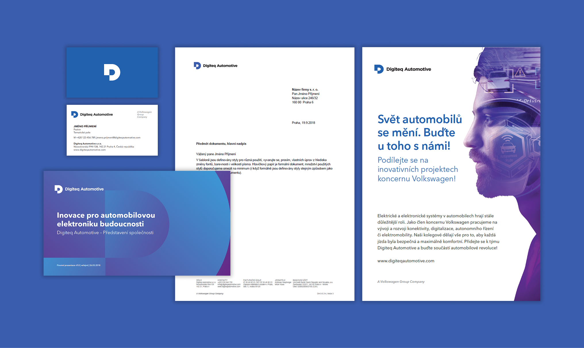
One of the solutions we arrived at – the letter D icon with a pixel as a nod to digitalization – met these criteria. It was simple, imaginative, and easy to read, which was also confirmed by informal testing. We eliminated the risk of unoriginality in a simple shape with a thorough research. And so the new logo was born!
Challenge 4
Visual style with automotive thoroughness
The final challenge, and perhaps the most important one for successfully achieving the goal, was to bring everything to life. In the automotive industry, precision-set processes are emphasized, and this manifested fully in this phase of the collaboration. We will probably never count the total amount of individual applications of the new style and detailed explanations. All efforts were directed towards ensuring that the company's identity could be maintained in the future without major interventions from external graphic designers.
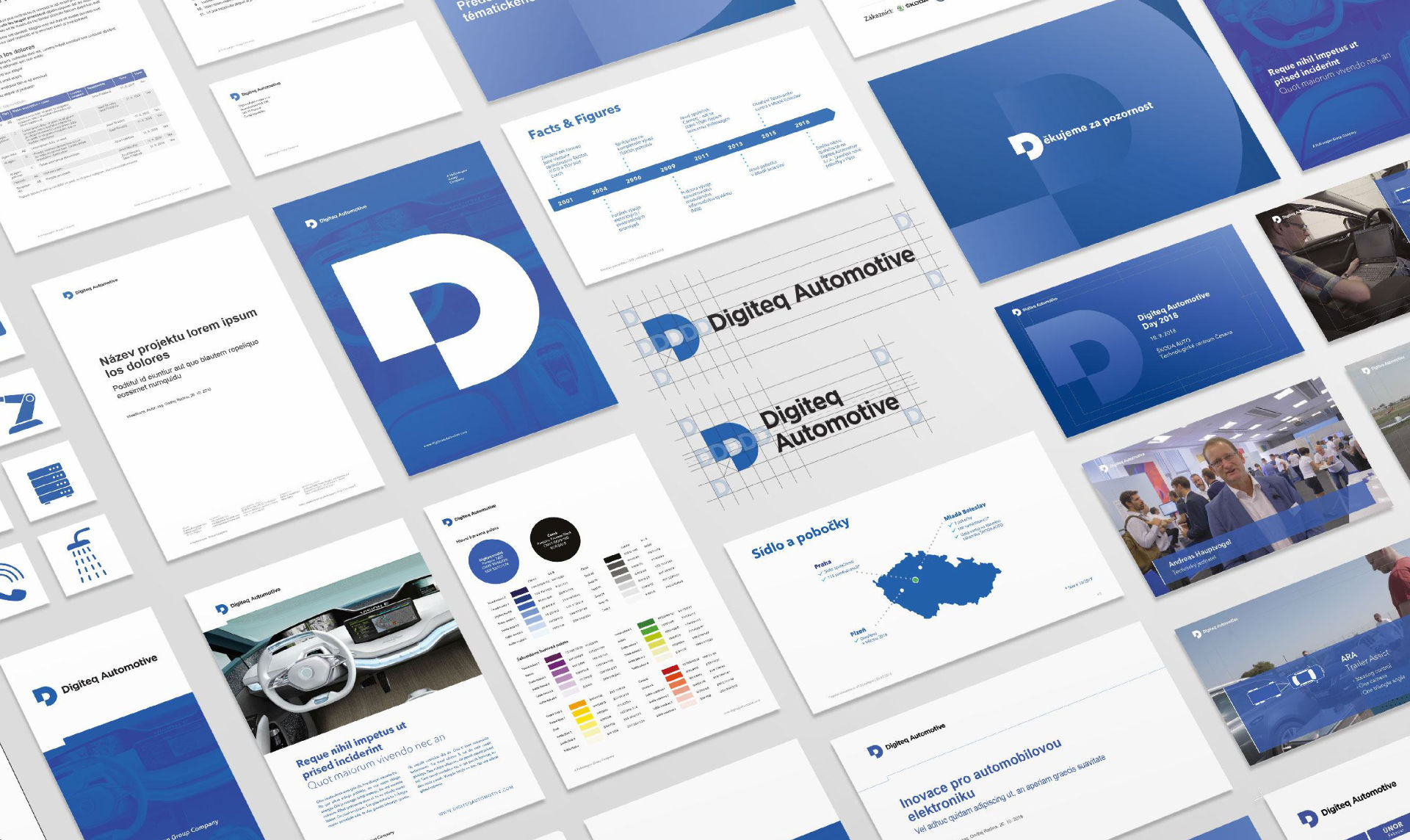
However, we didn't want to overwhelm the responsible people at Digiteq with a bunch of rules. Corporate identity is a living thing and, much more than rigid rules, it needs tools that make its use easier for users.
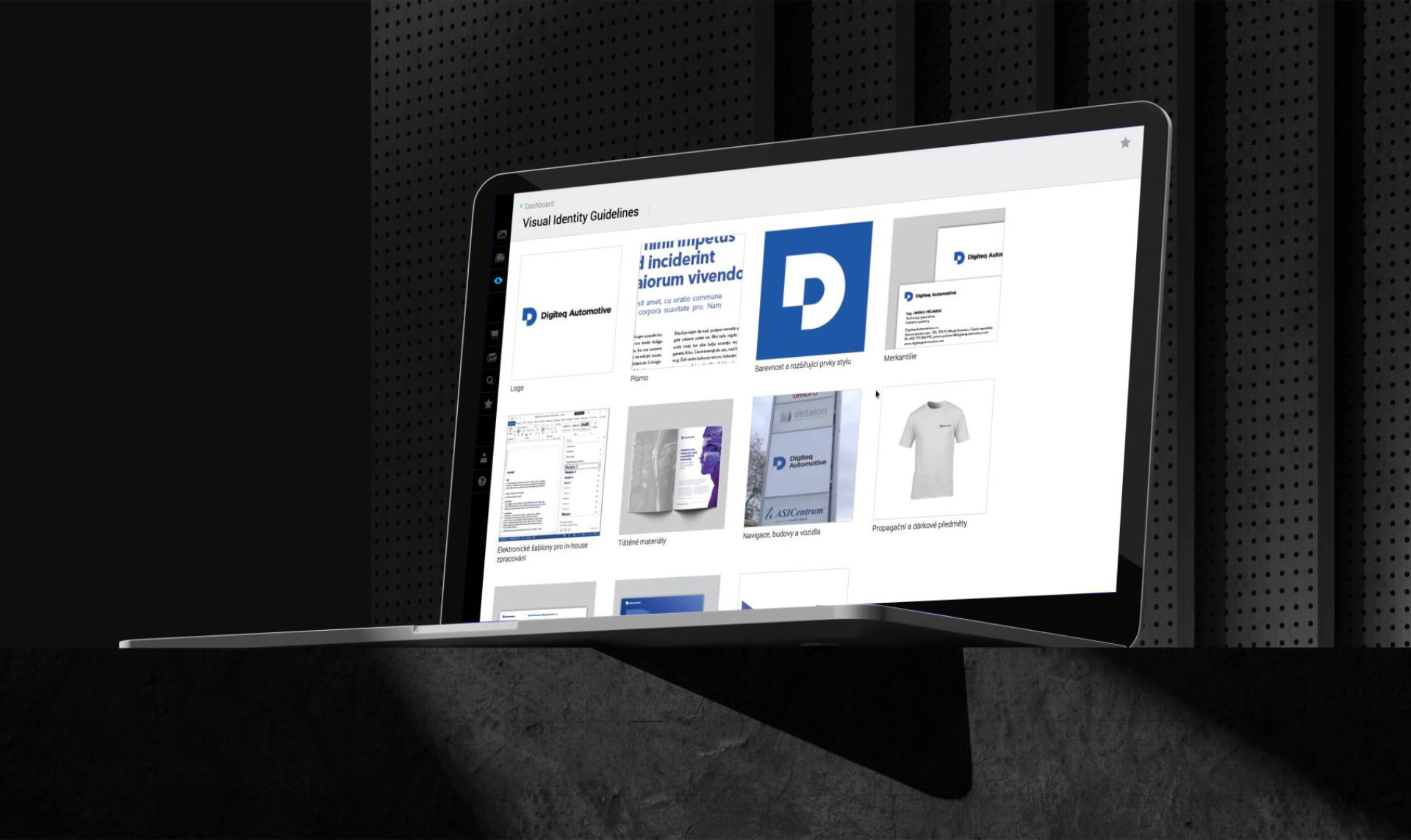
One such tool is our application Identity Online, where we clearly collect all outputs – from color definitions through fonts and basic rules of visual identity down to the last sticker or door sign. We are gradually adding to the library of applications in cooperation with Digiteq; on Identity Online, everything is available for download in every conceivable format and with proper instructions so that anyone who needs to can work with the visual identity without a hitch.
Credits
strategy/creatives
Tomáš Kostkan
design
Petr Vorasický
Jitka Slavíčková