Menu

Symbiosis of name, logo, and architecture

Client

CPI Property Group

When developer CPI approached us, they were nearing the completion of one of the largest development investments in the center of Prague — a new retail, administrative, and apartment building designed to connect shops, cafes, offices, and premium living into a vibrant urban hub. Our task was to create a name, logo, and visual style that would capture this concept.

What we did

Name, logo, visual style, communication strategy, and presentation materials

  • How to name a building so that it is internationally understandable and easy to remember?
  • How to visually capture modern architecture and a premium character without the result feeling cold?
  • And how to present the entire project to demanding future tenants who expect not only a top-notch space but also a strong brand?


Step 1

Defining solid brand foundations

There are plenty of new office buildings in Prague, but only a few have a name that people actually use. Our goal was for Prague residents to adopt the new name and start using it as naturally as they say they are going "to Veletržák" or "to the Museum".

At the beginning, we therefore needed to understand how the new building should behave towards its guests and residents:

  • What should it mean to them?
  • What kind of atmosphere and feeling should it evoke?
  • How should it differentiate itself from other buildings in the center of Prague?


During a workshop with the developer, we agreed that this building is a place where different rhythms of the city meet daily: work, living, shopping, and leisure. The goal was to create a brand that connects these worlds.
Step 2

A name hidden in the architecture

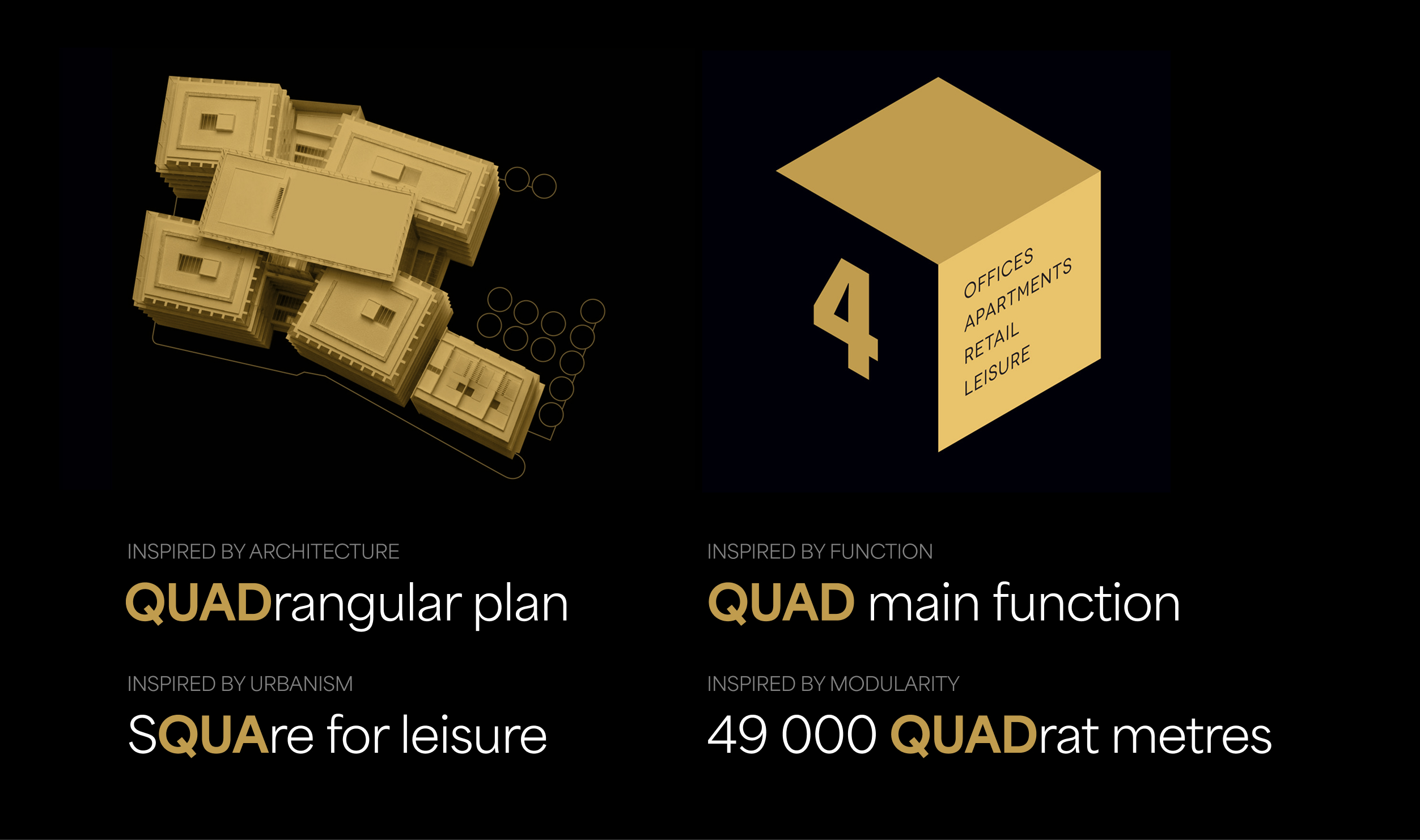
Simultaneously with defining the position, the architectural character of the building was also a determining factor for us. It consists of four connected blocks, features an open floor plan, and clean, sharp lines.

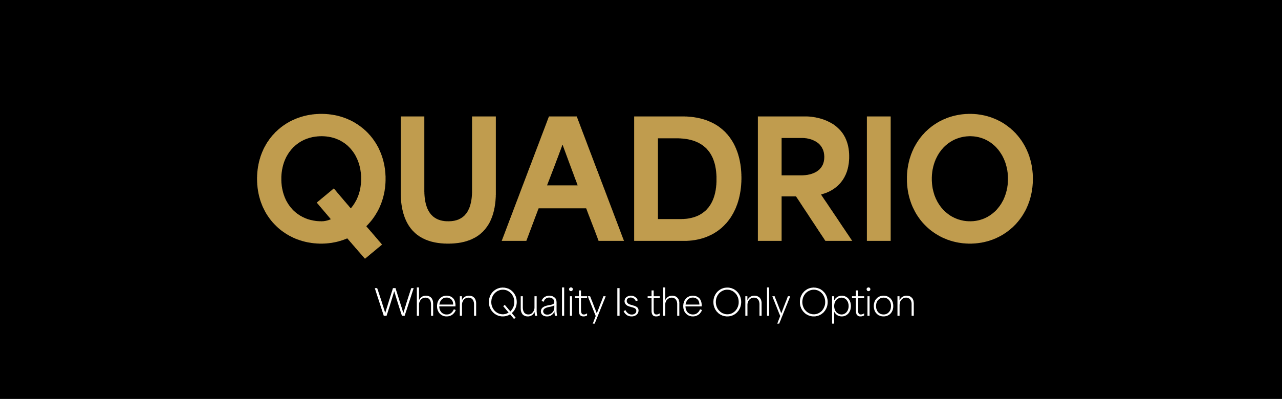
The name Quadrio honors these principles: it refers to the four (quattro) parts of the building as well as its four main functions - work, living, shopping, and time for entertainment and relaxation. At the same time, it sounds highly elegant, memorable, and is internationally understandable. It also subtly carries an echo of the word "Quality". It is a small detail, but it naturally reinforces the perception of the building as a place that offers a high standard of services and environment.

Tvorba názvu
Naming Quadrio

Requirements of a good name – fulfilled.

  • Sounds good
  • Is short and simple
  • Is internationally understandable
  • Pronounces well in Czech and other languages
  • Has a connection to architecture
  • Can be easily registered
  • Has an available domain

Step 3

When a graphic identity captures the essence of a name

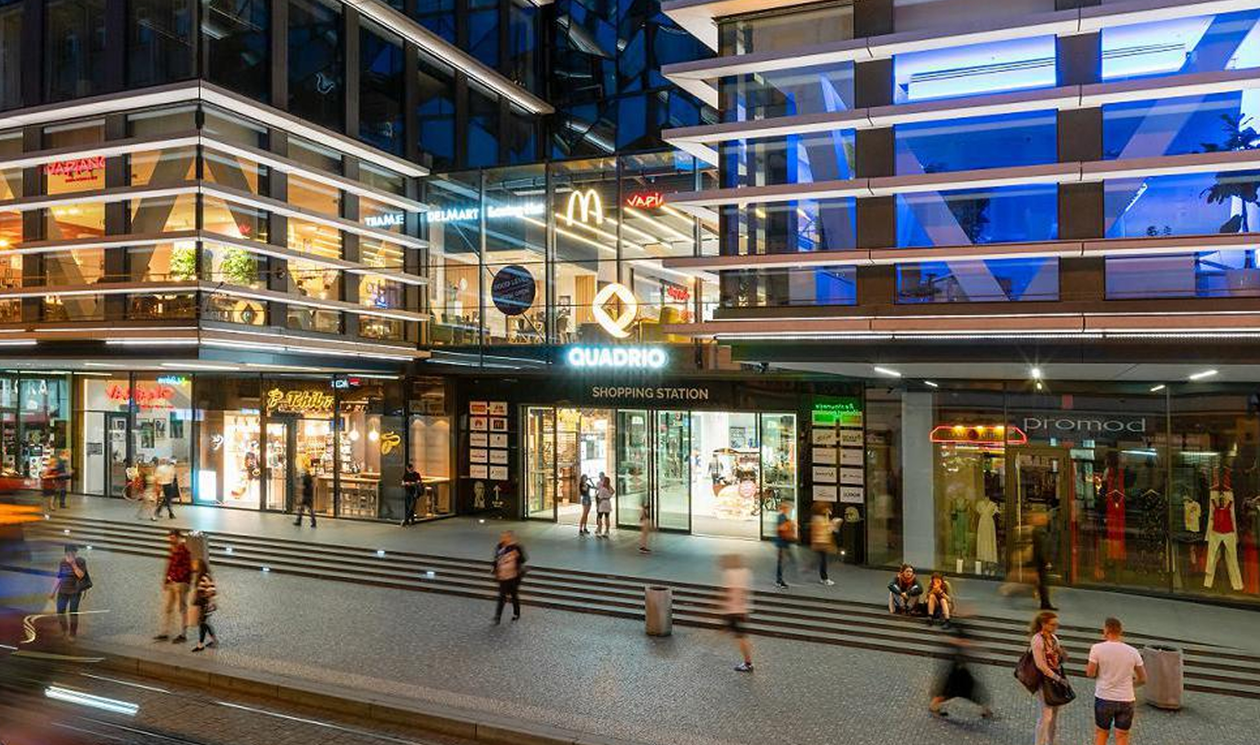
The visual style followed naturally from the new name. No unnecessary decorations, no extra effects. The logo is built on a simple and well-balanced typeface that feels confident and precise. A square motif appears in the graphics – not literally, but as a principle that holds everything together. The color palette and typography are simple and elegant, just like the building itself.

design loga

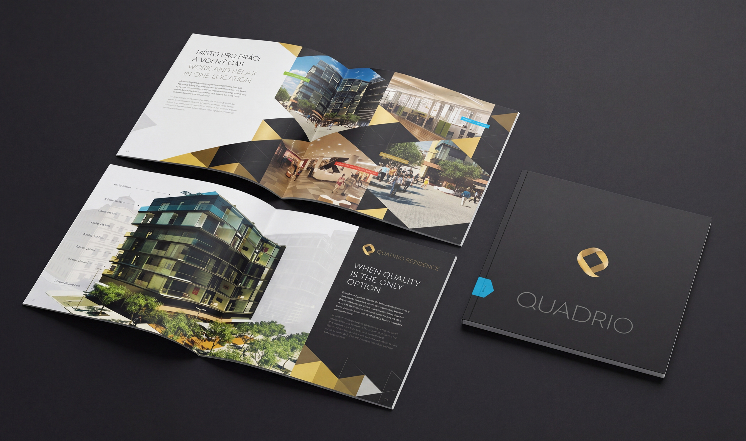
A prominent application of the visual style (besides the website) consisted of catalogs for future tenants of offices, apartments, and retail spaces. The exclusivity of the offer was highlighted by a generous graphic design, integrated augmented reality elements, and the print execution method.

design katalogů

Can we help with the communication of your exceptional project too?

Get in touch with us.


Insights

Follow our social media